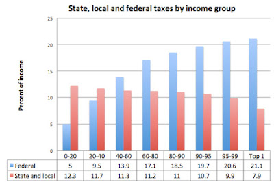
This chart from the Washington Post shows that the poorer you are, the more state and local taxes take a larger share of your income:
People at the top end of income brackets pay more of their taxes to the federal government than to state and local jurisdictions. Politicians like Trump who argue for more tax cuts for the wealthy conveniently point to the federal tax burden while ignoring the overall impact of all taxes. When federal, state and local taxes are considered, the structure is far from progressive. So when someone argues about the 47% who do not pay taxes, show them this chart, which demonstrates that the relative tax burden is not much different for the fortieth percentile up to the stratospheric 1%

