One of the inconvenient truths that might be considered during the town hall format for the second presidential debate is the ever rising cost of health care in America. The truth is we as a nation spend the most for health care in the world, but the result as measured in life expectancy is only mediocre. These two charts show the current situation:

In general living longer means more health care costs. Japan has the highest life expectancy of over 81 years versus 77 years for the United States. Logically, one would assume that per capita health care costs would be less in the United States since older citizens tend to need more care. Nevertheless, the United States exceeds Japan's per capita cost of health care by a wide margin (purple line). Cuba, a poor socialist country, has the same average life expectancy as the United States. Yet it spends less than $200.00 per capita, one of the lowest amounts in the world to achieve the same measure of success. The chart below shows how policies can lead to better health care apart from just spending money. Cuba has limited resources, but has made health care a national priority; it has universal health care and one of the highest doctor to patient ratios in the world while the United States has the world's largest military establishment:

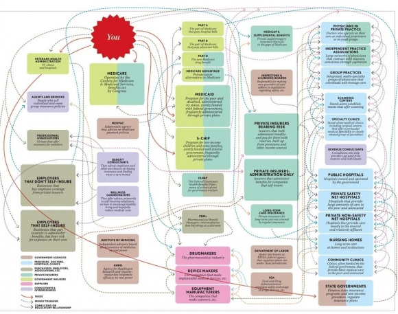
Granted, it can be argued that Cuba is an inapposite example given its command economy. Switzerland, a rich social democracy, spends the second largest per capita amount on health care of $3300 compared to $4500 in the United States. It also achieves a life expectancy in excess of the US average life span as do the major countries of the European Union, Canada and Australia. One reason we get such poor results may be found in this flow chart of our current system (click for a larger version):
[credit: Jon Cohn, New Republic]